Select size (Size guide cm/inches)
Better To Burn Out Poster
Product Description
Make a Statement with "Better To Burn Out"
About the product
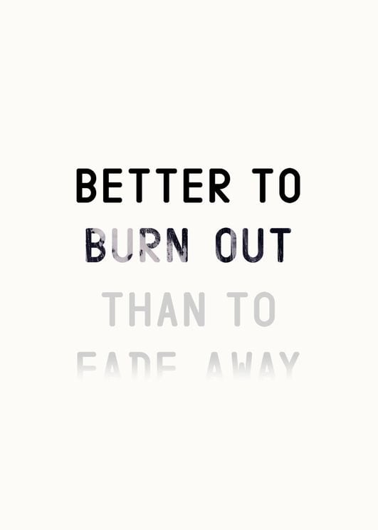
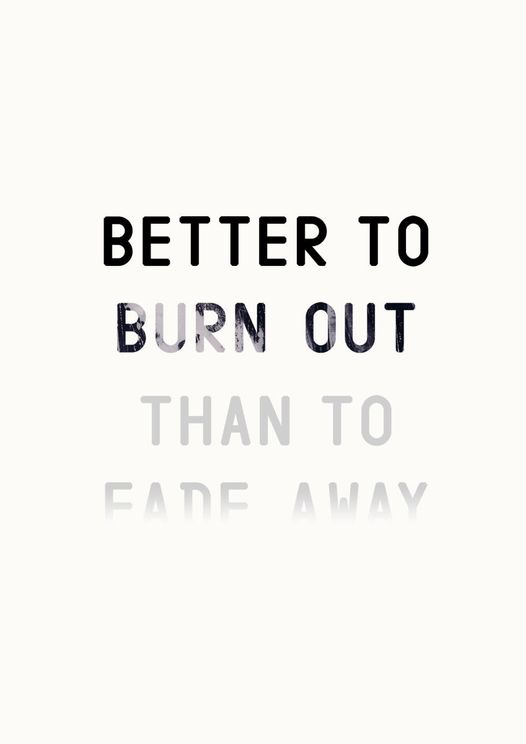
This striking typographic art print features the phrase "BETTER TO BURN OUT THAN TO FADE AWAY" with an artistic layout. The bold black typography of "BETTER TO" transitions into a distressed and textured "BURN OUT," while the concluding phrase "THAN TO FADE AWAY" fades into grayscale tones, visually mirroring its meaning. The off-white background further enhances the clean, minimalist design.
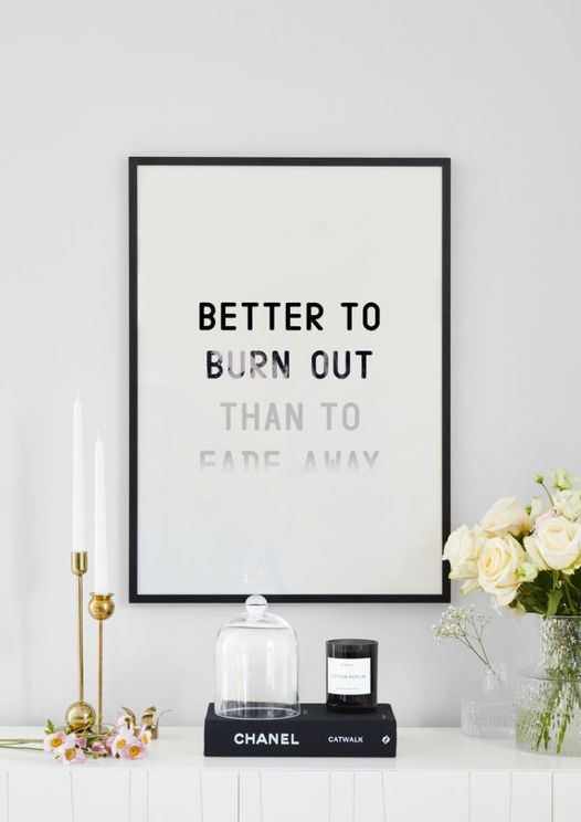
Perfect for those who love bold, thought-provoking artwork, this poster adds a dramatic yet modern touch. It sets a reflective, intense mood and fits beautifully in spaces emphasizing individuality, such as studios, home offices, or industrial-style interiors.
Product Specification
- Material: 240g premium matte paper
- Sizes: 21×30 cm (A4), 30×40 cm, 40×50 cm, 50×70 cm, 70×100 cm
- Frame: Sold separately (available in oak, black and white)
- Production: Sustainable printing in Scandinavia
Why Choose Dear Sam?
- 30-day return policy - try at home risk-free
- Fast delivery 2-4 business days
- Sustainable production with eco-friendly materials
- Scandinavian design since 2016
Add a bold and thoughtful touch to your space with "Better To Burn Out" from Dear Sam!